Power Apps Components: Exploring the UI Elements

Microsoft Power Apps is a low‑code platform that lets you build custom business apps without having to write traditional code. At the heart of every canvas app are controls—visual and interactive elements that display information, capture user input and connect to data sources. Understanding what these controls do and how to configure them is essential for creating intuitive experiences. This article breaks down the most commonly used controls in Power Apps and offers practical guidance for when and why to use them.
Understanding Controls in Power Apps
Controls in a canvas app fall into a few broad categories:
- Display controls show information but do not accept user input.
- Input controls allow the user to enter or choose data.
- Data display controls present multiple records or datasets from a data source.
- Form controls provide a ready‑made user interface for viewing or editing a single record.
- Media and miscellaneous controls handle images, audio, video and other specialised tasks.
Each control has properties—such as Text, Items, Default and OnSelect—that determine its appearance and behaviour. These properties can reference formulas, so controls can react dynamically to changes in data or user actions.
Classic vs. Modern Controls
Power Apps now offers two families of controls: classic controls, which have been available for years, and modern controls based on Microsoft’s Fluent 2 design system. Modern controls are designed to be quicker and simpler to configure and provide a more cohesive end‑user experience. The trade‑off is that they expose fewer styling properties; for example, many visual properties available on classic controls—such as DisabledFill, HoverColor or PressedBorderColor—are not present on modern controls. Font sizes in modern controls are measured in pixels instead of points, which means default text appears smaller, and modern controls use a new theme engine rather than the classic themes.
Other behavioural differences include:
- OnSelect property – In classic controls nearly every control had an
OnSelectproperty, making it easy to attach actions to any element. Many modern controls no longer supportOnSelect, so if you need clickable behaviour you should use a button, icon or image instead. - Reset property – Classic controls could all be reset by setting the
Resetproperty. Modern controls no longer support this approach; you must callReset(ControlName)to reset individual controls. - Mixing controls – Because modern controls follow a different visual language, mixing classic and modern controls within the same app can lead to inconsistent appearance. It’s generally best to pick one family and stay with it.
- Separate number input – In classic apps you would use a text input and constrain it to numbers; modern controls introduce a dedicated Number Input control with properties like
Min,Max,StepandPrecision, making numeric input more explicit.
Enabling modern controls
Modern controls are not enabled by default. To turn them on in your canvas app:
- Open your app for editing in Power Apps Studio.
- On the command bar, choose Settings > Updates.
- On the New tab, find Modern controls and themes and set the toggle to On. Enabling this option refreshes the authoring experience and adds two new categories—Classic and Classic icons—so you can still insert older controls when needed.
After enabling modern controls, explore the updated Themes pane to see the modern theme options. Keep in mind that only a subset of modern controls are generally available today, and Microsoft continues to expand and refine this set.
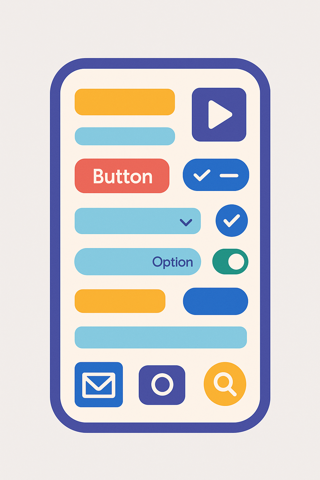
Display Controls
Label
Classic: Text Label
Modern: Text
A label displays static or dynamic text. You set its Text property to a literal string or a formula that returns a string. Labels are often used as headings, captions or to display calculated values. Key properties include:
- AutoHeight – When set to
true, the control grows vertically to fit all the text; whenfalse, overflow is truncated. - Color (Classic), Font and FontWeight – Control how the text looks.
- Live (Classic) – Configures how screen readers announce updates (Off, Polite or Assertive) for accessibility.
Icon
Classic: Classic Icons
Modern: Icon (preview)
Icons add visual cues to your app. Power Apps includes a library of built‑in icons (search, mail, camera, etc.) that you can insert via Insert > Icons. You can adjust the Color(Classic), Size and OnSelect properties just like other controls. Use icons sparingly to aid navigation or illustrate actions.
Input Controls
Text Input
Classic: Text input
Modern: Text input and Number input (a dedicated numeric input)
The text input control allows the user to enter text, numbers or passwords. Configure the Default property to set an initial value. The Mode property determines whether the control is SingleLine, Multiline or Password. You can restrict data entry by setting Format (e.g. to Number), MaxLength, HintText (placeholder) or DelayOutput (helpful for delaying expensive operations such as filtering until the user finishes typing). Use formulas in the OnChange or OnSelect properties to respond to user input.
Button
Classic: Button
Modern: Button
A button triggers an action when tapped or clicked. You set the OnSelect property to a formula that runs when the button is pressed—common tasks include navigating to another screen (Navigate(ScreenName, ScreenTransition)) or submitting data with SubmitForm. Buttons can display text or an icon and support many styling properties (e.g., Fill, HoverColor, PressedColor, RadiusTopLeft for rounded corners). Use buttons for commands such as Save, Cancel or Next.
Check Box and Toggle
Classic: Check box, Toggle
Modern: Checkbox, Toggle
Check boxes and toggle switches capture boolean values. A check box shows a square that the user can select or clear; a toggle shows a sliding switch that indicates true or false. The Default property defines the initial state, while the OnCheck and OnUnCheck (for check boxes) or OnChange (for toggles) properties specify actions that run when the state changes.
Slider
Classic: Slider
Modern: Slider
A slider lets the user pick a numeric value by dragging a handle along a track. Set Min, Max and Default to define the range and starting value. You can also adjust Step to control the increments. Use the slider for settings such as volume, rating levels or selecting a range for filtering data.
Drop‑Down List
Classic: Drop down
Modern: Dropdown
A drop‑down shows a single selected item from a list until expanded. It conserves space when the list is long. Important properties include:
- Items – A table or list that supplies the choices. If your data source has multiple columns, set Value to the column you want to display.
- Default – The initial selected value.
- AllowEmptySelection – When
true, users can leave the selection blank. - OnChange – Runs a formula when the user selects a different item.
Use drop‑downs for single‑select lists when the number of choices is moderate and search isn’t needed.
Combo Box
Classic: Combo box
Modern: Combobox
A combo box extends the drop‑down by adding search and multi‑select capabilities. It’s ideal for large lists or people pickers. Key properties include:
- Items – The data source that provides the options.
- DefaultSelectedItems – One or more items that appear selected by default.
- SelectMultiple – When
true, the user can choose multiple values. - SearchFields – One or more fields to search when the user types; this makes server‑side searching efficient for large datasets.
- Layout – Determines whether each item displays one field, two fields or a picture plus two fields (useful when selecting people).
Radio and Rating
Classic: Radio, Rating
Modern: Radio, Rating
Radio buttons let the user select exactly one option from a short list. The Items property specifies the choices, and the Default property selects which item is initially chosen. Rating controls enable star‑style ratings (e.g. 1 to 5) and have properties such as Max (number of stars) and Value (current rating).
Date Picker
Classic: Date picker
Modern: Date picker
The date picker presents a calendar widget so that users can choose a date. Set DefaultDate to specify the starting value (often Today()). Use MinDate and MaxDate to restrict the selectable range. The OnChange property can trigger actions such as filtering records or setting default values in related controls.
Data Display Controls
Gallery
Classic: Gallery
Modern: No modern gallery (continue using the classic gallery)
A gallery displays a set of records from a data source. Each record appears as an item containing multiple controls (e.g., labels, images, icons). You edit the gallery’s template—shown as the first item—to configure the layout of every item. Galleries support vertical (portrait) or horizontal (landscape) orientations and predefined templates for showing images and text. Key properties include:
- Items – The data source or collection to display.
- Default – The record initially selected.
- Selected – The record currently selected by the user. Use this to drive details in a form.
- Selectable – Whether items can be selected; when
true, screen readers treat the gallery as a selectable list.
Galleries are perfect for browse screens that list customers, products or any other repeatable data.
Data Table
Classic: Data table
Modern: Table (modern, preview)
A data table shows rows and columns with headers. It is read‑only—users can select a row but cannot edit data directly. You choose which fields to include and their order. Important aspects include:
- Items – The table or collection to display.
- Selected – The current row, which you can use to populate details in another control.
- Column configuration – You can show or hide columns and reorder them, and adjust the width of each column. However, styling individual columns isn’t supported.
- Limitations – Data tables cannot yet display images or allow in‑table editing, and only one row can be selected at a time.
Use data tables when you need a familiar grid view of read‑only data, such as lists of orders or transactions.
Form Controls
Display Form
Classic: Display form
Modern: Modern form (preview) (a unified form control)
A display form shows the fields of a single record. Set the DataSource property to a table and the Item property to the specific record you want to display—often this is GalleryName.Selected. Users cannot edit data in a display form; it’s intended for read‑only views. Each field appears in a card control; you can set which cards are visible and their order.
Edit Form
Classic: Edit form
Modern: Modern form (preview)
An edit form allows users to edit or create a record. Like the display form, set DataSource to a table and Item to the record you want to edit. When the form’s Mode is Edit, the fields show current values and can be modified. When the mode is New, fields show default values. Use the SubmitForm(FormName) function in a button’s OnSelect property to save changes, and ResetForm(FormName) or NewForm(FormName) to discard changes or create a new record. Forms handle validation and expose properties such as Valid, Error, OnSuccess and OnFailure to provide feedback.
Media & Miscellaneous Controls
- Classic: Image, Camera, Microphone, Audio, Video, PDF Viewer, Pen Input, Charts, Timer
- Modern: Only a few modern media and miscellaneous controls exist (for example, the Stream control for video); most media controls are still classic.
- Image – Displays pictures from a file, URL or data source. Use for branding, product photos or icons.
- Camera and Microphone – Capture photos, videos or audio directly in your app. Configure OnSelect or OnAudio events to save the captured media.
- Audio and Video – Play media clips stored in your app or retrieved from a URL. Set Media, AutoStart and Volume properties.
- PDF Viewer – Shows the contents of a PDF file (preview feature). Set the Document property to a URL or data source containing PDF content.
- Pen Input – Allows drawing with a finger or stylus and stores the result as an image; ideal for signatures.
- Charts (Column, Line, Pie) – Visualise numeric data; configure Items, Series and axis properties.
- Timer – Perform an action after a set interval; set Duration and actions for OnTimerStart, OnTimerEnd.
Layout & Containers
Classic: Horizontal and vertical containers, Screens
Modern: Additional modern layout controls such as Header, Tabs and Tab List are available, but the primary container controls remain classic.
Building a clean, responsive interface often requires grouping controls. Containers (horizontal and vertical) automatically position and size their child controls relative to each other so you don’t have to specify exact X and Y coordinates. Containers make it easier to create flexible layouts that adapt to different screen sizes. You can also use Screens as top‑level containers to separate different parts of your app.
Tips for Choosing and Configuring Controls
- Match the control to the data type. Use drop‑downs for single‑select lists, combo boxes when search or multi‑select is required, sliders for numeric ranges and date pickers for dates.
- Set defaults thoughtfully. The Default or DefaultSelectedItems properties determine what users see initially. Pre‑selecting sensible defaults reduces friction.
- Use formulas to bind controls. Many properties can reference formulas. For example, set a form’s Item to
GalleryName.Selectedto show details of the selected record, or useIfstatements to switch a button’s Visible property on or off. - Combine controls for richer experiences. A common pattern is a Gallery linked to an Edit form, with a Button to save changes. The gallery shows records, and selecting an item loads it into the form.
- Consider accessibility. Provide meaningful AccessibleLabel values and ensure controls have sufficient contrast. Use the Live property on labels so screen readers announce updates appropriately.
- Leverage containers. Horizontal and vertical containers simplify responsive layouts and reduce manual positioning. Enable AutoHeight on labels and AutoWidth on columns to handle varying content gracefully.
Conclusion
Power Apps offers an extensive set of UI controls that allow makers to craft rich, interactive experiences without writing code. By understanding the purpose of each control, setting properties thoughtfully and combining controls effectively, you can build apps that not only look polished but also guide users through complex tasks with ease. Experiment with these components, explore their properties and mix them to suit your business processes—your users will appreciate the resulting clarity and productivity.